Sonata
Published October 15, 2026 · CLASSICAL
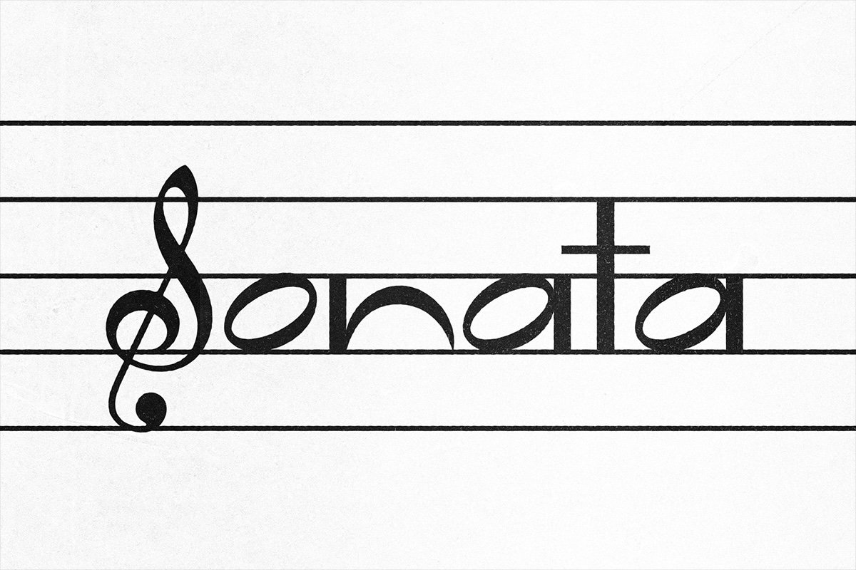
Sonata is a display typeface designed by Rosa de Vera that is inspired by musical... Der Beitrag Sonata erschien zuerst auf slanted.
The intersection of music and visual design has found a novel expression in Sonata, a display typeface crafted by designer Rosa de Vera. Rooted in the intricate world of musical notation, this typeface exemplifies how graphic design can transcend traditional boundaries and embody the rhythms and structures of musical composition.
Rosa de Vera’s personal journey into this creative synthesis began in childhood with classical piano lessons, a common experience among many Asian youths. The complexity and visual distinctiveness of musical scores fascinated her, offering a window into a symbolic language that conveyed pitch, tone, and tempo through unique glyphs and lines. This early exposure nurtured a lasting curiosity about the parallels between auditory and visual modes of expression.
As de Vera advanced into her design career, this fascination evolved into a conceptual inquiry: what shared principles govern both musical composition and typographic design? Sonata emerged as the tangible answer to this question. The typeface’s construction is deeply informed by the structure of the musical staff, employing the five-line system as a foundational grid. This approach allowed for an innovative method of defining typographic dimensions such as baselines and x-heights, traditionally dictated by more conventional parameters.

In creating Sonata, de Vera undertook a process of deconstructing standard musical notation to uncover its underlying structural elements that could be mapped onto letterforms. This meticulous analysis revealed a natural affinity between the shapes used in music scores and typographic forms, providing a conceptual bridge between the disciplines.
The resulting typeface encourages users to engage with typography beyond mere legibility, inviting exploration of where text functions simultaneously as a communicative language and as an artistic image. Sonata plays with dynamism and ambiguity, challenging conventional reading habits by blending graphic symbolism and textual form.
This design also carries a broader significance in the field of type design by demonstrating how disciplines often viewed as separate can inform and enrich each other. Sonata underscores the potential of typographic art to incorporate thematic and structural influences from other creative languages, in this case, music.

Details about the release timeline and distribution of Sonata remain limited, but its conceptual foundation positions it as a meaningful contribution to display typography. It stands as a testament to Rosa de Vera’s ability to translate a lifelong engagement with music into a visually compelling design language.
By bridging graphic design and musical notation, Sonata exemplifies how typefaces can be more than functional tools; they can also serve as expressive media that resonate on multiple sensory levels. This innovative approach opens pathways for future explorations where typography is not only read but experienced in new, immersive ways.
Slanted.de reports on Sonata as an illustration of contemporary type design’s potential to reinvent traditional forms by integrating cultural and artistic influences from diverse domains. Rosa de Vera’s work invites ongoing dialogue about the relationship between visual and auditory creativity and expands the horizons of what typography can achieve.
Full story & global impact
This article was synthesized and rewritten by MusicTop Editorial from reporting published by slanted.de. Read the publisher's report for the complete source context.
Read original source: slanted.de